
Top 3 Things Wedding Venues Get Wrong on Their Websites
From unclear next steps to frustrating mobile experiences and galleries that miss the full setting, these common website mistakes can cost wedding venues qualified inquiries.
By Chayton Pfannenstiel
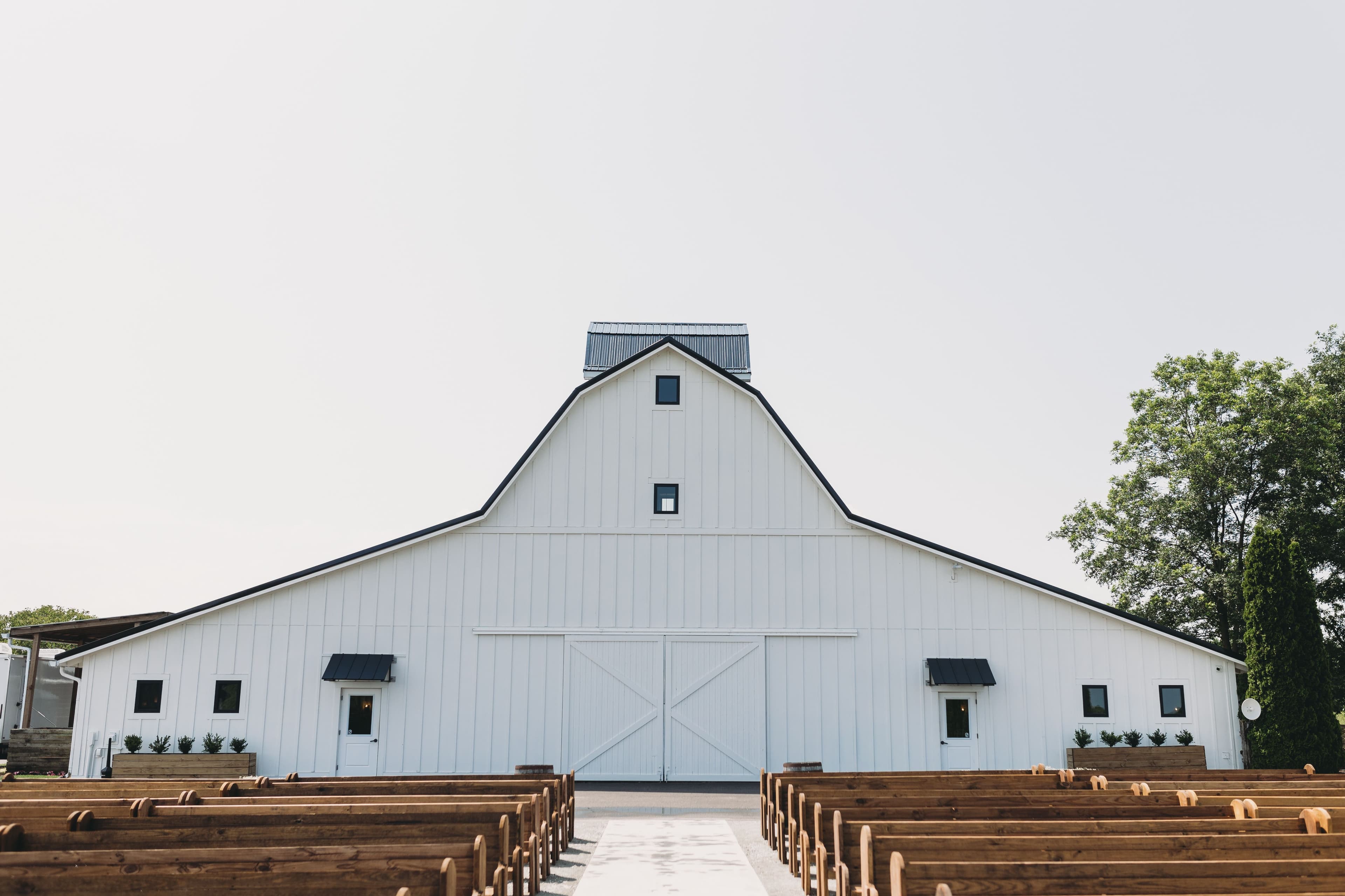
Top 3 Things Wedding Venues Get Wrong on Their Websites
Your website is often the first tour a couple takes of your venue.
Before they schedule an in-person visit, couples are comparing galleries, checking capacity, looking for pricing information, and deciding whether your space feels like the right fit for their wedding. A beautiful venue can still lose an inquiry if its website makes the decision harder than it needs to be.
Here are three common mistakes wedding venues make online and how to fix them.
1. Unclear Calls to Action
A call to action, often shortened to CTA, is simply the next action you want a visitor to take.
For a wedding venue, that could be:
- Schedule a Tour
- Check Availability
- Request Pricing
- Download Our Brochure
- Start Your Inquiry
Many venue websites show great photos but leave visitors unsure what to do next. The contact page may be buried in the navigation, the inquiry form may be hard to find, or there may be no clear prompt after someone finishes browsing the gallery.
That creates friction.
Friction is anything that makes a visitor pause, search, guess, or work harder than necessary. Every extra step gives a couple another chance to leave the site and keep comparing venues.
A stronger approach is to make your primary next step visible throughout the website. Add a “Schedule a Tour” or “Check Availability” button in the header, at the end of key pages, and near your photo galleries or pricing details.
The goal is not to pressure couples. It is to make the next step simple when they are ready.
2. A Poor Mobile Experience
A venue website may look great on a desktop computer but still be frustrating on a phone.
That matters because mobile traffic is substantial. StatCounter reported that mobile devices accounted for 50.29% of worldwide web traffic in May 2026. In the United States, mobile represented 43.31% of web traffic over the prior year. That means a large share of potential couples may first experience your venue on a smaller screen. StatCounter: Worldwide Device Market Share StatCounter: United States Device Market Share
Google also uses the mobile version of a website for indexing and ranking through its mobile-first indexing system. In plain terms, your mobile website is not an optional secondary version, it is a major part of how Google understands your site. Google Search Central: Mobile-First Indexing Best Practices
For venues, a poor mobile experience often looks like:
- Tiny text that is difficult to read
- Large images that load slowly
- Galleries that are awkward to swipe through
- Forms that are frustrating to complete
- Buttons that are too small to tap
- Important information hidden behind menus
- A phone number that cannot be clicked to call
A couple should be able to visit your site on their phone and quickly understand your venue, view the space, find the guest capacity, and submit an inquiry without zooming in or fighting the page.
Test your own website from a phone. Ask yourself: can someone schedule a tour in under a minute?
3. Failing to Capture the Venue’s Full Feel
Beautiful detail photos are important, but they are not always enough.
Couples are not only evaluating tables, flowers, or a close-up of the ceremony arch. They are trying to picture the full experience:
- What does it feel like to arrive?
- How private is the property?
- How do the ceremony and reception spaces connect?
- What do the outdoor areas look like?
- Is there room for cocktail hour, lawn games, photos, or a tent?
- What is around the venue?
A strong website should help answer those questions visually.
That is where walkthrough videos, venue tours, and aerial photography can make a major difference. A walkthrough can show the guest journey from parking to ceremony to reception. Aerial footage can show the full property, surrounding scenery, outdoor spaces, and the scale of your venue in a way traditional photography cannot.
This does not replace professional ground-level photography. It completes the story.
When couples can better understand your space before contacting you, they are more likely to submit a qualified inquiry and arrive for a tour already excited about what they have seen.
Final Thoughts
Your website should make it easy for couples to understand your venue, picture their wedding day, and take the next step.
Clear calls to action reduce friction. A strong mobile experience keeps potential couples engaged wherever they are browsing. And walkthroughs, aerial footage, and intentional galleries help visitors feel the full character of your space.
A venue website does not need to be complicated. It just needs to make a strong first impression and give couples a clear reason and an easy way to reach out.
Article Images